
Think about the last time you tapped onto a stranger's Instagram profile. You probably gave the top of the page a heartbeat of attention before deciding whether to follow or keep scrolling. Most of that split-second call comes down to one small block of text, your bio, doing an outsized amount of work.
Here's the strange part: nearly everyone leaves that block in the plain default font and never touches it again. It's one of the simplest wins on the entire platform, sitting there unused. Drop in a few styled characters and a generic, forgettable bio suddenly looks like it was put together on purpose.
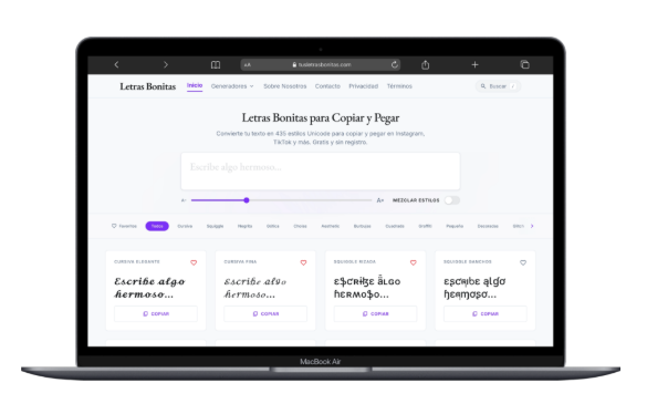
Getting those characters takes seconds. A generator such as Letras Bonitas turns ordinary words into dozens of styled variations, and if you want options shaped for the app itself, Letras para Instagram hands you fonts you can copy and paste straight into your profile.
After testing bio layouts across several very different accounts, I've boiled it down to the seven moves that reliably shift the needle, plus the one habit that quietly undoes all of them.
1. Let the font echo your niche
Before you touch a single character, get clear on the mood of your account. A flowing script feels right for a florist, a life coach, or a wedding photographer. A crisp monospace or a heavy sans-serif lands better for anything in tech, fitness, or business.
The style you choose is a signal in its own right. When it fits your world, visitors relax and trust the page more quickly. When a serious investment account leans on playful, looping cursive, something feels slightly off, even if the visitor couldn't tell you exactly why.
So settle on one look and stick with it. Cramming three different fonts into a single bio reads as chaotic, not creative.
2. Don't leave the name field plain
This is the spot most people overlook. The name line beneath your username accepts styled characters too — and because Instagram displays it in bold and pulls it into search, it carries real weight.
Drop your styled keyword right there. A potter might go with "Leo ✦ Handmade Ceramics" in a soft serif. A travel account could run a delicate italic reading "Notes from Noor." That one line frequently draws more eyes than the bio underneath it.
3. Give the text room to breathe
A solid block of words is rough to read on a small screen. A few well-placed breaks fix that instantly — a small dot, a star, a slim line between thoughts. Something like:
📍 Made in Porto
✨ Weekly design notes
🔗 Shop the link below
Every line now has space around it, so the reader takes it in with a single glance instead of wading through a paragraph. Just keep the symbols restrained; two or three across the whole bio is plenty.
4. Build a quiet hierarchy
Not every line should carry the same weight. Work out which detail matters most, then let that line stand out with a bolder or heavier-looking style.
Your strongest hook sits up top in the sturdier font. The supporting details follow underneath in something lighter. It's the same logic behind a well-made poster, your eye catches the big element first, then drifts down for everything else. A structure that consistently works: a bold identity line, a soft description, and a clear call to action.
5. Frame the word that matters
Light decoration, a pair of small stars, a soft bracket, a thin border pulls attention toward a specific word without raising its voice. Wrapping a phrase in gentle marks gives it a subtle frame.
Save this for the single word you most want people to hold onto: your service, your city, your offer. Frame that one element and leave everything around it clean. Push it any further and the bio tips over into visual clutter.
6. Carry the style across the whole profile
Your bio doesn't stand alone. When the font in your bio echoes your highlight covers and the opening lines of your captions, the entire profile starts to feel deliberate.
I once reworked a small tea shop's page using a single consistent script across the bio and the highlight titles. Within a couple of weeks, saves and profile visits crept upward, nothing else about the account had changed. That coherence alone was enough to make the page look professional. Choose your style once, then repeat it everywhere.
7. Readability wins over prettiness — always
This is the rule people break most. Some of the prettiest fonts collapse into empty boxes on certain phones, older Android handsets especially. If a chunk of your audience sees squares where your letters should be, you've already lost them.
Before you commit, always check your bio on a second device. Screen readers also stumble over heavily styled characters, which chips away at accessibility and can quietly shrink your reach. The target is beautiful and legible. Beautiful but unreadable does nobody any good.
A few common questions
Will fancy fonts hurt how I show up in search? Search reads plain keywords far more easily, so keep at least one clear, searchable term, ideally in your name field, in normal or barely-styled letters. Beyond that, style the rest of your bio however you like.
Are these actual fonts? Not really. They're special Unicode characters designed to resemble styled letters. That's exactly why you can paste them almost anywhere, and also why a handful of devices render them differently.
How many styles can one bio handle? One main style, with maybe a second for a touch of contrast. Anything past that starts to feel busy and slows readers down.
Wrapping up
Your bio is a two-second pitch, and a handful of styled letters help you win those seconds. Begin with one font that suits your niche, add a little breathing room, shape a simple hierarchy, and test for readability before you call it done. Do that, and your profile stops looking like a default template and starts looking like something you actually designed.
So, which of these seven are you trying on your bio first?