
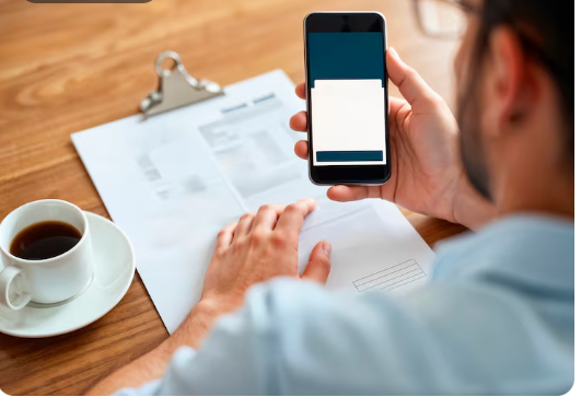
A significant share of clients read freelance proposals on a phone, often while doing something else. Anything designed for a desktop reading experience is being evaluated in conditions it was not built for.
This changes the formatting rules in ways most freelancers have never adjusted for.
What breaks on a small screen
Long opening paragraphs. Four lines on a desktop become eleven on a phone, and eleven lines before the first point is made is where readers stop.
Elaborate structure. Nested bullets, tables and multi-level headings compress badly and often reflow into something unreadable.
Heavy attachments. A twelve megabyte deck frequently does not get opened on mobile data at all, which means the best evidence in the proposal goes unseen.
What works instead
Short paragraphs, two or three lines each. One idea per paragraph. Flat bullets if any. Numbers written as digits, since they are what the eye catches when skimming. And one lightweight attachment, correctly named. Tools that assemble proposals, including the Getmany platform and comparable products, are most useful when they enforce this discipline rather than producing longer output.
The first sentence carries even more weight on mobile than on desktop, because the preview a client sees in the response list is shorter.
A test worth running
Send your last proposal to yourself and read it on your phone, standing up, while distracted. Most freelancers discover their opening takes three screens to reach the point and that their attachment does not open cleanly.
The fix takes ten minutes and applies to every proposal afterwards.
The underlying principle
Formatting is not decoration, it is a bet about how the document will be read. Betting on a client at a desk with time is a bet that loses most of the time. Density and brevity are not stylistic preferences here, they are adaptations to the actual reading conditions.
About Getmany
Getmany builds proposal, CRM and automation tooling for freelancers and agencies on Upwork. More at getmany.com.