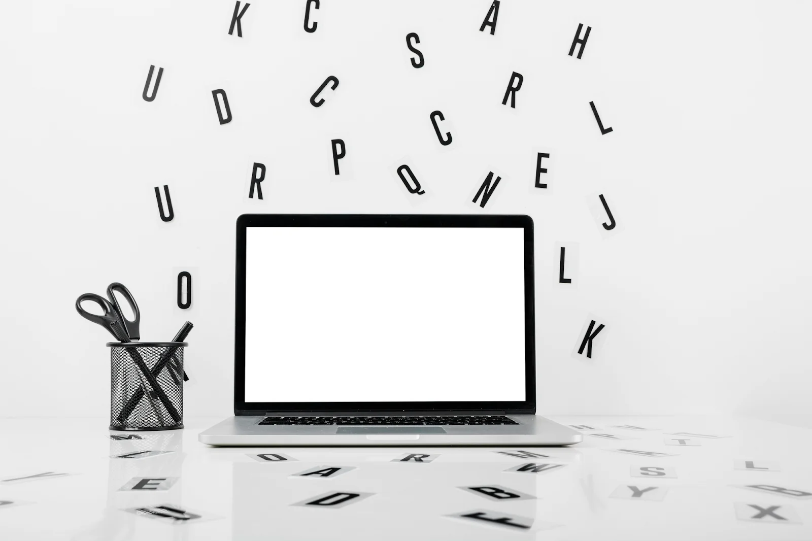
Everyone's profile looks the same. Same font, same layout, same default formatting that the platform provides and almost nobody stops to question. You scroll through hundreds of bios in a given week and they all blur together into one undifferentiated block of information. Then occasionally one stops you – not because it says something radically different, but because it simply looks different from everything around it. The text itself signals that the person behind it put thought into presentation, and that signal alone is enough to earn an extra second of attention. In a space where attention is genuinely everything, that second matters more than it might seem.
The tools that make this possible have been around for some time, but awareness of them remains surprisingly uneven across different communities. Unicode character sets contain thousands of characters that mimic styled Latin letters – bold, italic, script, gothic, monospace, and more – and these render in social bios and post captions across most major platforms. More creative communities have picked this up quickly. Spaces like sankra casino online, where visual identity and user experience are deliberately crafted down to the typographic level, demonstrate how much personality can be conveyed through formatting choices alone before a single word of content is even read. The same logic applies to personal profiles and brand accounts.
What text styles actually exist and where they work
The variety available is considerably wider than most people realize. Beyond simple bold and italic – which many platforms support natively through markdown-style formatting – Unicode offers styles that have no standard keyboard equivalent. Each one creates a distinctly different visual impression and suits different kinds of content and audiences.
Style name | Example appearance | Best used for |
Bold serif | 𝐁𝐨𝐥𝐝 𝐭𝐞𝐱𝐭 | Emphasis, headlines in bios |
Italic serif | 𝐼𝑡𝑎𝑙𝑖𝑐 𝑡𝑒𝑥𝑡 | Soft emphasis, creative writing accounts |
Script / cursive | 𝒮𝒸𝓇𝒾𝓅𝓉 | Lifestyle, personal brands, aesthetic accounts |
Gothic / blackletter | 𝔊𝔬𝔱𝔥𝔦𝔠 | Music, fashion, high-contrast visual identity |
Monospace | Mono | Tech, developer profiles, retro aesthetic |
Small caps | ꜱᴍᴀʟʟ ᴄᴀᴘꜱ | Subtle distinction without heavy styling |
Strikethrough | S̶t̶r̶i̶k̶e̶ | Humor, irony, conversational posts |
Each of these works differently in context. Script styles read as warm and personal – they suit lifestyle creators, poets, and anyone whose brand is built around aesthetic sensibility. Gothic or blackletter reads as bold and slightly edgy – it works for musicians, certain fashion niches, and accounts that want visual contrast without using color. Monospace has a deliberately retro-tech quality that resonates in developer communities and with anyone whose identity leans into precision or craft.
How to use styled text without making it worse
The single most common mistake with styled text is overuse. Styling every word in a bio produces visual noise rather than clarity – the eye doesn't know where to land, and the effect becomes chaotic rather than distinctive. The rule that works consistently: style the element you most want someone to notice, and leave everything else plain. A practical and reliable approach is to use one styled element per section of a bio. In a bio, that might mean a styled name or title at the top, plain text for the description, and perhaps a single styled phrase at the bottom as a call to action or tagline. This creates hierarchy without clutter – the styled text functions as a visual anchor, and the plain text around it is easier to read by contrast.
Platform compatibility is absolutely worth checking before committing to a style. Most Unicode character sets render correctly on Instagram, Twitter, TikTok, and LinkedIn, but some specialized characters display inconsistently depending on the device and operating system. The safest approach is to generate the styled text, paste it into a preview, and verify it renders correctly across at least one mobile and one desktop view before making anything permanent.
The difference between decoration and identity
Used well, styled text does something meaningful beyond simply looking interesting. It communicates something about who you are before the reader has processed what you've actually written. A script font in a bio says something different than gothic lettering, which says something different again from clean monospace. These associations aren't arbitrary – they've developed through years of consistent use in specific cultural contexts, and audiences read them intuitively even without being able to articulate exactly why a given style feels right or wrong for a given account.
This is precisely why the best use of creative text styles isn't about chasing visual novelty or standing out for its own sake. It's about alignment – finding the style that matches the identity you're building and using it with enough consistency that it becomes recognizable. The goal was never to look styled for its own sake. The goal is to look like yourself, only more deliberately and consistently. When that alignment works, the formatting becomes genuinely part of the identity rather than decoration applied on top of it, and the profile stops disappearing into the feed.